COLOUR STORIES - How a shade comes to life: Sage
When you look at our colour Sage now, a subtle, muted blueish Green, you would never guess that in its early days it was a very bold colour for Eliv Rosenkranz. I founded the company out of a love for neutral, earthy tones and for a long time I decided that I would never make our palette overly colourful. And I certainly didn’t see a Green or Blue in it (at least in the classic, primary colour sense).

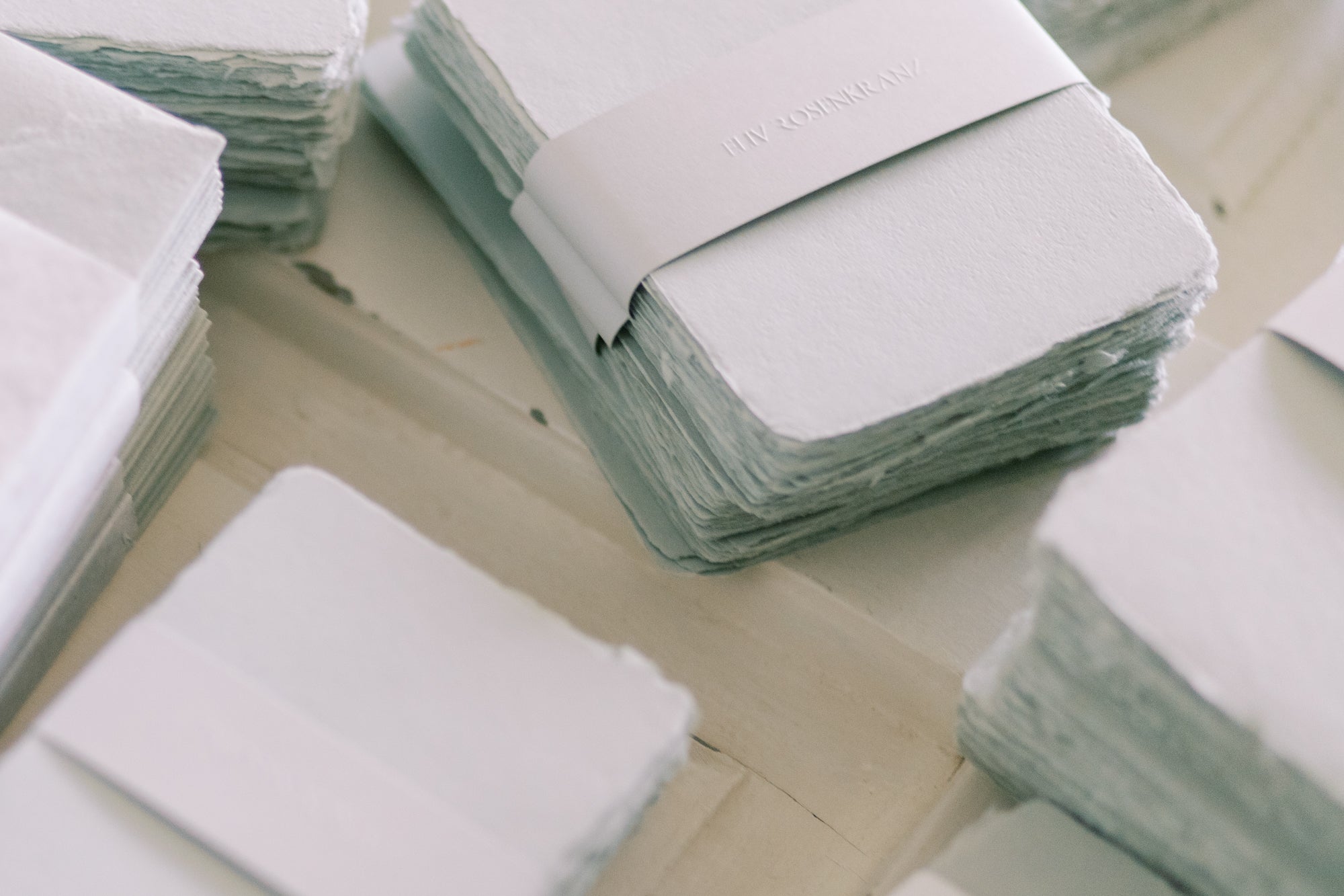
Sage, one of the first non-neutrals in our palette
In the beginning we used pigment pasts to colour the pulp. Those were not primary colours like red, yellow, blue, black but pre-mixed colours, among others a beautiful green-blue. I fell in love with it and my determination to keep our repertoire radically neutral started to wane.
At the beginning of 2021 I felt like experimenting with new colours, so we tried the green-blue from the colour fan. Of course, as with many other pigments before it, the colour of the dried paper was brighter than when it was unprocessed. Thus began the process of colour mixing. After finding the perfect shade of green-blue, it was clear to us that it should be included in our Custom Colours. And it immediately became a favourite of you, our customers!
I began to understand that there was a way to do colourful but in a neutral way. So in a way, Sage lead the way to other ‘bolder’ colours like Dusty Rose.

We almost took it out of our repertoire
But then we hit a big road black when we had our pigment change and process optimization in late 2021. Sage was definitely the colour that gave us the worst headache. We were working with primary colours now and had to remix the shade from Yellow, Blue, Red. It was a lengthy and tedious process in which we even considered taking it out of the repertoire.
But in the end we arrived back at the Sage spirit and we’re so glad we stuck with it (Thanks again to our patient customers!).
To this day, Sage is a very popular colour, it immediately evokes a Mediterranean summer feeling in me.

Claudia's personal design recommendations
Design suggestions:
After seeing Lenka's work in hot foil stamping, I fell in love with the colour all over again:
I also adore the way Delphine worked with it:
These pretty envelopes got the perfect liner by Jas:
Fonts I would recommend with Sage:
Bold and contemporary: Milligram
SHOP NOW


Leave a comment